Two artists can draw the exact same script and produce comics that feel completely different. The difference is usually layout — how panels are sized, shaped, and arranged on the page.
Layout isn't decoration. It's the steering wheel. It decides how fast a reader moves, where their eye goes, and which moment hits hardest. Here's how to drive it on purpose.
Start With the Grid
A grid is a regular arrangement of panels — say, a tidy 3x3 or a 2x3. It feels basic, and that's the point. The grid is your baseline, the steady heartbeat of a page.
Grids do three useful things:
- They keep reading flow predictable, so the reader never gets lost.
- They make a deliberate change mean something when you finally break the pattern.
- They're forgiving — even an uneven page reads cleanly inside a grid.
Most working comics use a grid for the majority of their pages. Save the wild stuff for when it counts. New creators often do the opposite, and our roundup of common comic creator mistakes covers why that backfires.
Gutters: The Space Between
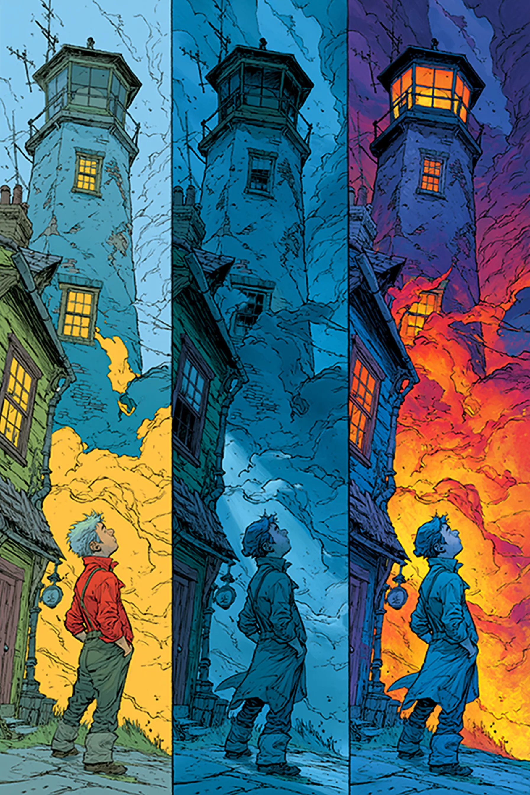
The gutter is the gap between panels. It looks like nothing, but it's where the reader's brain does the work — filling in the moment between one frame and the next.
Wider gutters create a small pause. Tight gutters speed things up and pull panels into a single rushing beat. Keep gutter width consistent within a page unless you have a reason to change it; inconsistent gutters read as a mistake, not a choice.
Panel Size and Shape Equals Emphasis
This is the core rule: bigger panels get more attention and more time. A reader instinctively lingers on a large panel and skims a small one.
Use that:
- Big panel — the key story beat, the emotional punch, the reveal.
- Small panels — fast action, quick cuts, a beat of montage.
- Tall thin panel — a full-body moment or a slow vertical drop.
- Wide letterbox panel — a landscape, a calm moment, a held silence.
If every panel on your page is the same size, you're giving every moment equal weight — which means none of them stand out. Vary deliberately.
Reading Flow and the Z-Pattern
In left-to-right languages, readers scan a page in a Z: across the top row, down, across again. Your layout has to cooperate with that path or readers stumble.
Watch for these traps:
- Ambiguous panel order. If two panels sit side by side at the same height, the reader takes the left one first. Don't fight it.
- Balloon placement that crosses panels. A speech balloon drifting into the next panel can send the eye the wrong way. Lettering 101 covers placement in detail.
- Tier breaks. A panel that spans a full row should be read before anything below it. Keep that clear.
Test it the easy way: hand a page to someone who's never seen it and watch their eyes. If they hesitate, the layout needs work.
Splash Pages and Breaking the Grid
A splash page is a single full-page panel. A spread is a single image across two pages. They are your loudest tools — use them like an exclamation point, not a comma.
Good moments for a splash: a major reveal, a hero shot, the cliffhanger that ends an issue. Bad moments: a quiet conversation, page two of forty for no reason.
Breaking the grid — tilted panels, panels that bleed off the edge, overlapping frames — signals chaos, speed, or a shift in reality. It works because the rest of your book is orderly. Break the grid everywhere and nothing reads as broken.
Layout Is Pacing You Can See
Every layout choice is a pacing choice. Six small panels rush. One big panel holds. A splash page stops time. When you plan a page, ask what the reader should feel there — then size your panels to deliver it.
This is also where AI comic tools earn their keep. NarrInk's narrative intelligence reads your whole story and makes editorial pacing decisions across it, so quiet scenes get room to breathe and action pages stay tight — the same calls a human comic editor makes about page rhythm.
Layout works best alongside the rest of the craft. Pair it with a clear comic book script, study deliberate comic pacing, and see how layout drives a full graphic novel storyboard.