Readers never compliment good lettering. They only notice bad lettering — when they read a panel in the wrong order, lose track of who is speaking, or squint at a cramped bubble.
Lettering is the layer that decides whether your script actually gets read the way you wrote it. It is also the easiest craft skill to learn, because it runs on a handful of clear rules. Here they are.
Reading Order Comes First
In left-to-right languages, readers scan a panel top-to-left first, then down and right, in a rough Z pattern. Every bubble you place either reinforces that path or fights it.
Place the first line of dialogue in the upper-left of the panel and the last in the lower-right. When two characters talk, their bubbles should descend like stairs. If a reader has to jump backward or up to find the next line, you have broken the panel. This connects directly to your panel layout — bubbles and panels guide the eye as a team.
Speech Bubble Placement
A bubble should sit near its speaker but never bury the art. Aim for the negative space — sky, walls, empty floor — that the artist left open. If you are scripting for an AI tool, build that breathing room into your prompts so the art is not crowded edge to edge.
A few placement rules worth memorizing:
- Never cover a face. Especially not the eyes. Expression is the panel.
- Group a character's bubbles together so a multi-line speech reads as one connected beat.
- Leave a margin from the panel edge. Bubbles that kiss the border feel claustrophobic and can get cropped in print.
Tails: Point Clearly
The tail is the little pointer that connects a bubble to its speaker. It should aim at the speaker's head or mouth, full stop. Curve it slightly if you must route around art, but never let two tails cross — crossed tails scramble who said what.
Tail variations carry meaning:
- Solid tail: normal speech.
- Bubble-trail tail (a string of small circles): thought.
- Jagged or electric tail: a voice through a phone, radio, or speaker.
- No tail, bubble pointing offscreen: a speaker outside the panel.
Caption Boxes
Captions are the narration layer — boxes, usually squared off, that carry a narrator's voice, time stamps, or location labels. Keep them visually distinct from speech bubbles so readers never confuse narration with dialogue.
Use captions to compress time and place fast: "Three weeks later." "The harbor, after midnight." They do work that would otherwise eat an entire panel. Just do not let them narrate what the art already shows — captions should add information, not echo it. If you want narration and dialogue to feel like two different voices, our guide on writing dialogue for comics goes deeper.
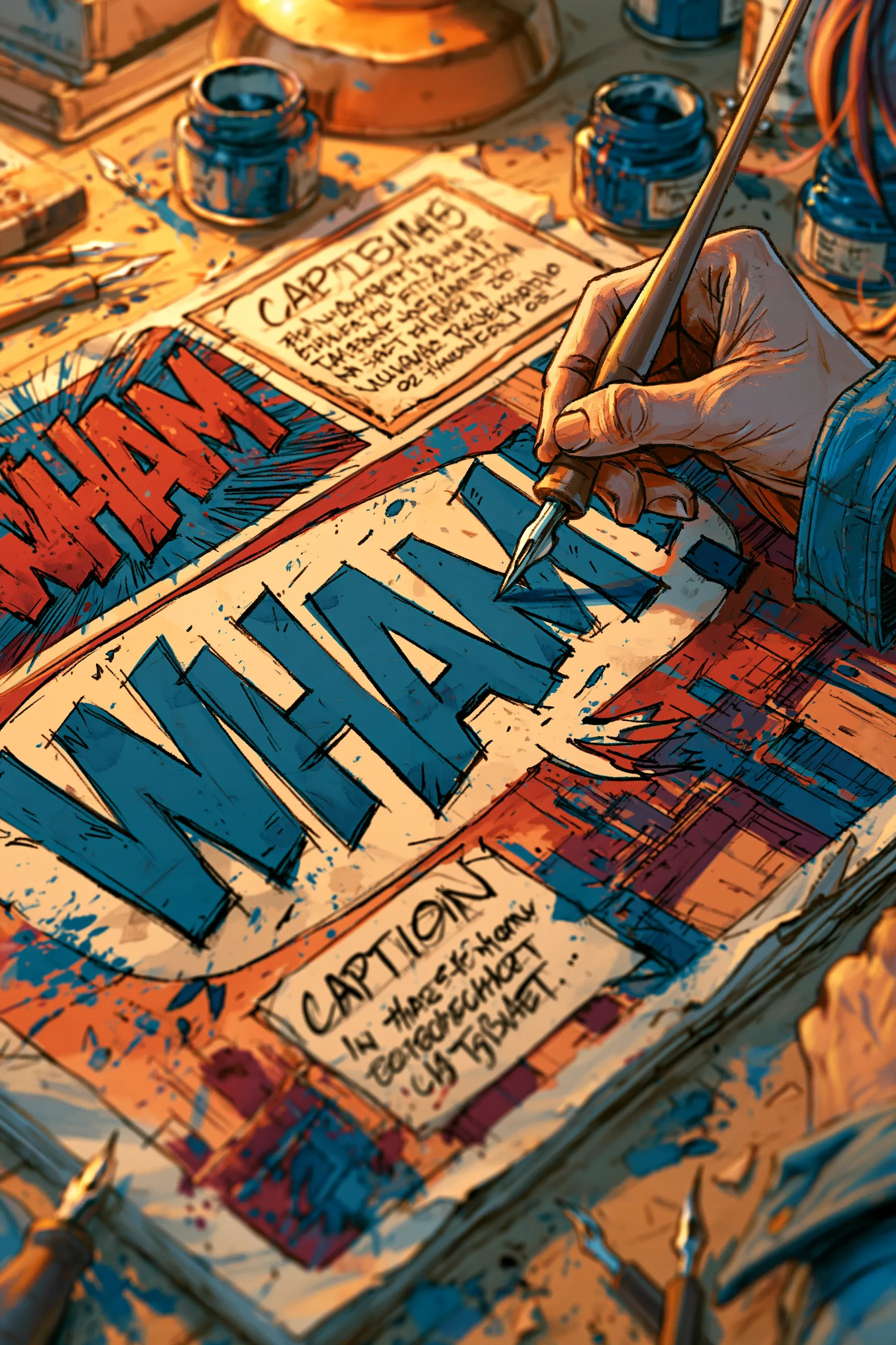
Sound Effects
SFX lettering is where you get to have fun. Sound effects are part of the art, not the text layer — they should sit inside the panel, scaled and styled to match the sound.
- Scale to volume. A whispered tap is small; a KRACKOOM fills the panel.
- Style to texture. Sharp jagged letters for breaking glass, soft rounded letters for a splash.
- Color to the source. A gunshot and a thunderclap should not look identical.
- Place SFX at the source of the sound so the reader connects effect to cause instantly.
Font and Readability
Use a dedicated comic lettering font, not a system serif. Lettering fonts are designed for the cramped, curved space of a bubble. Keep one font for dialogue across the whole book. Reserve bold for genuine emphasis — if everything is bold, nothing is.
And keep your lines short. A bubble crammed with 30 words is a wall. Break long speeches across multiple bubbles or multiple panels — that splitting is also a pacing tool.
Common Lettering Mistakes
- Bubbles placed out of reading order.
- Tails that cross or point at the wrong character.
- Text covering faces and key art.
- Captions repeating what the panel already shows.
- Fonts too small, or too many fonts.
When you generate a comic in NarrInk, dialogue is placed in reading order automatically, so the words land in the sequence you intended. You still bring the writing — the tool handles the flow.
Lettering is the bridge between your script and your reader. Pair it with a strong comic script and clean coloring, and your pages will read exactly the way you hear them in your head.